Design comparison
SolutionDesign
Solution retrospective
Feedback is highly welcome on any areas I can improve on.
Community feedback
- @ariannalilliePosted about 2 years ago
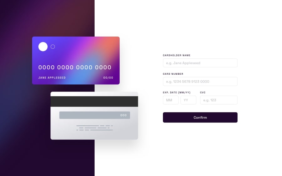
This looks great! My only comment would be to add some error handling. At the moment there is nothing stopping someone from typing more than 16 numbers for their credit card number. I would also suggest that you add some spacing between the form input fields.
0@sophronePosted about 2 years ago@ariannalillie Thank you for your feedback, it is highly appreciated. I will look into the issues you raised and make the necessary adjustments.
0
Please log in to post a comment
Log in with GitHubJoin our Discord community
Join thousands of Frontend Mentor community members taking the challenges, sharing resources, helping each other, and chatting about all things front-end!
Join our Discord
