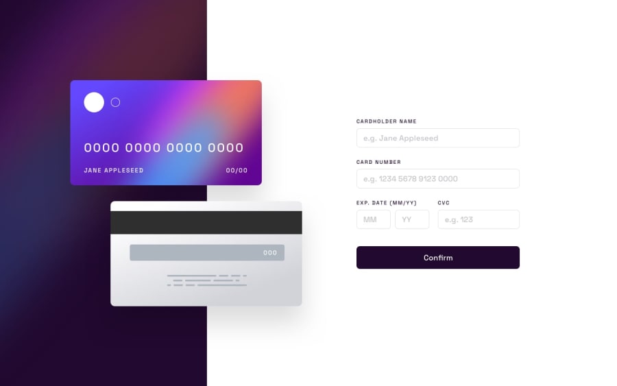
Interactive Card Details Form Using Tailwind CSS
Design comparison
Solution retrospective
Hey everyone! This is my solution to the Interactive Card Details Form Challenge 💳
Project Details
🆕 This was a great project to practice JavaScript and using Regex. I was also able to use aria-describedby and aria-live in order to make the form inputs accessible without nesting them in a label tag.
⚠️ At the time of submitting, I haven't tested full accessibility, but I will be resubmitting this challenge soon here when I do.
📱I used input listeners in order to add a live preview to the form, add an opacity transition upon completion, and reset the form back to default values when the user is finished.
Feel free to leave comments on how I can improve my code.
Thanks! 😎
Community feedback
- @asbhogalPosted about 2 years ago
This is awesome work Jack - near likeness to the design mockup. Index is nicely formatted too.
I've briefly tested the regex and it works for the most part, however the form accepts submissions where the expiry date month > 12 and year accepts any two digit combinations. The (MM/YY) directly above the year input also appeared a bit confusing at first, maybe worth joining this with the 'EXP. DATE' adjacent to it.
I've also noticed the responsive layout for the card divs at the top don't connect - see the breakpoints from 1439px to 376px in your browser.
Hope this helps.
Marked as helpful0@thejacksheltonPosted about 2 years ago@asbhogal First off, I'd like to say thanks for the feedback, Aman!
Here are some changes I made:
-
I removed one label tag and put the inner text into the other. From there, I wrapped both inputs in the label.
-
I've added another validation error by changing the same error div innerText, but only when the date month is > 12 OR the date year is past 2030.
-
For the responsive layout, I've given each form element a consistent width depending on mobile or desktop. The back card is now responsive to the design.
Again thanks my man!
0@thejacksheltonPosted about 2 years ago@asbhogal Hey Aman, I have a quick question, if you don't mind.
When I removed the 2nd label tied to the input, there is now an accessibility error.
This is because I can't have multiple form controls (inputs) tied to one label.
I can have multiple labels to one input, but not vice versa.
What confuses me, though, is the design seemed to have this in mind, like your suggestion, which is a big reason why I took the time to implement it.
https://gyazo.com/b99c194dd2c97db41f6986ec1f1ec529
The only other thing I can think of would be adding another label back and adding some margin or padding to it to make it look like both labels are conjoined. I don't think this is a good solution, though.
What are your thoughts?
0 -
Please log in to post a comment
Log in with GitHubJoin our Discord community
Join thousands of Frontend Mentor community members taking the challenges, sharing resources, helping each other, and chatting about all things front-end!
Join our Discord
