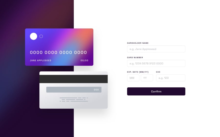
Interactive Card Details Form using React Hook Form
Design comparison
Community feedback
- @samuel-aduPosted over 1 year ago
Hi Suleman,
Thank you for taking out time to review my work, this means a lot to me.
-
Regarding the bouncer you suggested, I checked out the article you provided it doesn't serve the purpose I think your feedback wants me to correct but if you could explain further I would like to understand you correctly.
-
Curson pointer in the input field is part of what the project file specified in the active state and I also think input fields and buttons need to have a pointer as a visual cue for the user to interact with the element.
-
I used the position property to take the error message out of document flow so that it doesn't alter the page size as you rightly pointed out.
0 -
- @sulemaan7070Posted over 1 year ago
hey Samuel Adu great job on completing the challenge!! here are a few tips to make your site better...
1.I recommend you , to add a debouncer for the
card numberinput field. as it is not a good experience for the user to see this messageCard number must be 16 digitswhen he is typing. more about debouncing [here(https://www.freecodecamp.org/news/javascript-debounce-example/)📚2.The cursor:pointer on the input fields is not looking good you can remove that..
3.I suggest you to use the property
display:invisibleto hide the.errror-msgas it would not impact the layout.. when they disappear withdisplay:nonethe page size is altered..Happy coding💯😄👍🏻
0
Please log in to post a comment
Log in with GitHubJoin our Discord community
Join thousands of Frontend Mentor community members taking the challenges, sharing resources, helping each other, and chatting about all things front-end!
Join our Discord
