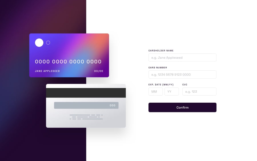
Interactive card details form [using jQuery] + [Re-design]
Design comparison
Solution retrospective
Firstly, in this challenge, I did a design overhaul with a dark theme. The card front and back are done largely using HTML and CSS to practice my CSS skills, instead of importing the default images. I am still struggling a little with the mobile & tablet versions thus they will be a work in progress.
I started learning jQuery so this is my first attempt using jQuery for the logic part. It took me longer than expected because of the syntax differences between jQuery and Javascript but I am glad I made it through.
Feel free to give any feedback.
Community feedback
- @visualdennissPosted over 1 year ago
Great job with this one Jo Young! I like your redesign and stylistic choices in this one. Looks classy.
One thing i'd like to add though is perhaps having a hover effect with box-shadows and all that bg-color changes for the input fields is a bit unusual for me as well as the cursor pointer. I associate those effects rather with a button than an input field.
Also input fields seem to have their default border, but u can improve that easily by changing its color to what you have for other elements.
Keep up the great work, i like the direction you go!
Marked as helpful1@Jo-cloud85Posted over 1 year agoHi @visualdenniss! Thank you for your constant support and encouragement! I really appreciate it a lot. My design is definitely still a work in progress but I hope to hone my design skills, along with my coding skills, with each challenge. Anyway, I have modified the input styles as per your advice and recommendations as they make sense 😅. Thanks once again!
1
Please log in to post a comment
Log in with GitHubJoin our Discord community
Join thousands of Frontend Mentor community members taking the challenges, sharing resources, helping each other, and chatting about all things front-end!
Join our Discord
