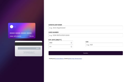
Interactive Card Details Form using HTML, CSS, JavaScript, and Flex
Design comparison
Solution retrospective
This is my solution to the Interactive Rating Component Page. Feel free to give any suggestion or pointing out any mistakes I made.
Community feedback
- @DavidMorgadePosted about 2 years ago
Hello Genesis, great job getting the solution for the challenge, this one is pretty tricky to position, congratulations!
If you don't mind I would like to give tou some feedback about your solution:
-
First of all you should try making your
<form>
a bit smaller, you could set up for example amax-width: 20rem
it will look better on higher resolution and it will also be adaptative when resizing to a less width screen! -
Give some spaces to your inputs for the date, also try using some
gap: 1rem
to separate a bit your exp.date from the CVC input. Giving those spaces for the error messages can be a good start to get the error messages without resizing the container. -
Regarding your Javascript, I would also recommend you to use
addeventListeners
instead of writingonsubmit
on your html, that can lead on a lot of bugs and is recommended to not use your functions directly in your html! try calling them in your JS instead!
Apart from that, really good job with the solution, hope my feedback helps you! nice job!
0 -
Please log in to post a comment
Log in with GitHubJoin our Discord community
Join thousands of Frontend Mentor community members taking the challenges, sharing resources, helping each other, and chatting about all things front-end!
Join our Discord