Design comparison
SolutionDesign
Solution retrospective
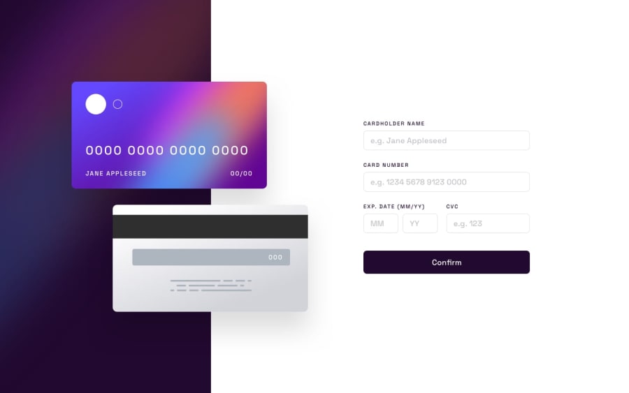
My first Junior challenge and my first time using Grid for something non-trivial! Please give me feedback on any aspect of it. I feel like the JavaScript can definitely be polished. Is there anything you'd do different with the layout or form validation? Etc.
Community feedback
- @marcelczubakPosted over 1 year ago
Great design!
After typing >18 digits for card number the whole page moves around. You should limit input to 16 digits, and numerical input only. Same for expiry and CVV.
👏
Marked as helpful1
Please log in to post a comment
Log in with GitHubJoin our Discord community
Join thousands of Frontend Mentor community members taking the challenges, sharing resources, helping each other, and chatting about all things front-end!
Join our Discord
