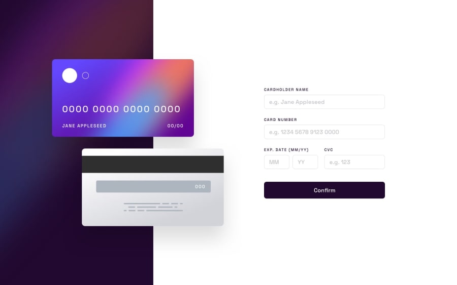
Design comparison
SolutionDesign
Solution retrospective
Honestly, I still have trouble with getting my layouts right when I start absolutely positioning elements. Here you can see that the footer with attribution gets in the way and things get ugly when the window is too wide or not high enough. I would really appreciate some tips on what's the best approach to solving this kind of problem.
Community feedback
Please log in to post a comment
Log in with GitHubJoin our Discord community
Join thousands of Frontend Mentor community members taking the challenges, sharing resources, helping each other, and chatting about all things front-end!
Join our Discord
