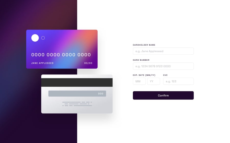
Design comparison
Solution retrospective
What's the best way to make responsive design?
Community feedback
- @mark-gardner74Posted about 2 years ago
Hi,
Nice work here! You ask about responsive design.
Mobile first: Now I am most certainly not the best at CSS but helpful to me is starting with mobile, your media queries start with a min-width when you get to tablet, and then desktop. You will only then change the bits that need to change having defined the bulk for mobile. An example would be having a column design for mobile (flex - column) which may change to flex - row when the screen gets bigger. Starting with desktop and then adjusting to mobile is more difficult to control;
Flexbox / Grid - all round the easiest way to make your content behave. If you use grid and need to change things around a little it is so much easier;
Use containers to wrap elements. You can control the container which will in turn constrain the elements within;
Try and stick with one unit of measurement as far as possible. em/rem dependent on what you are dealing with (rem for font, em for width/padding). Possibly %s but ems to me are the go-to.
Nice work and good luck with the next project.
Marked as helpful1
Please log in to post a comment
Log in with GitHubJoin our Discord community
Join thousands of Frontend Mentor community members taking the challenges, sharing resources, helping each other, and chatting about all things front-end!
Join our Discord
