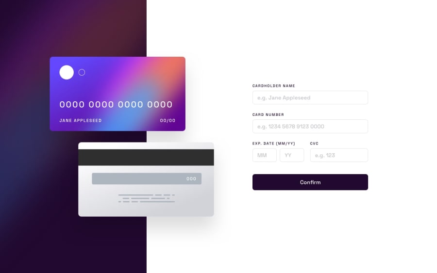
Design comparison
SolutionDesign
Solution retrospective
- Just a note that my site may get flagged as a phishing site by Chrome unfortunately
-
Would love any feedback about the responsiveness of the site and any pointers.
-
Since the month and year are separate inputs, it seemed there wasn't enough space to create validation messages for both of them so I decided to show only one message for both. Any better ideas for this would be great.
Community feedback
- @HameezAqeelPosted about 2 years ago
I also did the same and enclosed the month and year input tags inside a span and assigned a single div for displaying validation message.
1
Please log in to post a comment
Log in with GitHubJoin our Discord community
Join thousands of Frontend Mentor community members taking the challenges, sharing resources, helping each other, and chatting about all things front-end!
Join our Discord
