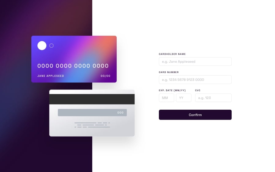
Design comparison
Solution retrospective
Greetings felows i build this Checkout form Challenge be sure to check it out.There are a few things that i could'nt figure out
- To show error message when wrong information is entered
- To change the border of fields when wrongs data in entered red or blue
I really love to hear how you have build it.
Feedback is always appreciated :)
Community feedback
- @nelsonleonePosted almost 2 years ago
It looks nice , but always check out your site preview on other website to see how it does.
And the form, it's meant to be fully interactive, i mean users seeing there input on keypress. you can use one of the onkey---,input or even onChange eventListener,
input.addeventlistner(event => { then update the display })
The button should have a cursor pointer or a hover event to show it's working .
Marked as helpful0
Please log in to post a comment
Log in with GitHubJoin our Discord community
Join thousands of Frontend Mentor community members taking the challenges, sharing resources, helping each other, and chatting about all things front-end!
Join our Discord
