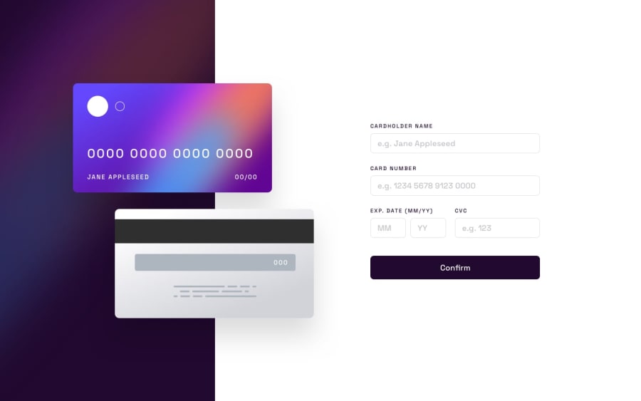
Design comparison
Solution retrospective
Hola! Dejo mi solucion, estoy haciendo mis primeras practicas de React(luego de un curso de 2 meses) , cualquier consejo sera bienvenido y bien recibido. Saludos
Hello! I leave my solution, I am doing my first React practices (after a 2-month course), any advice will be welcome and well received. Regards (translated with google)
Community feedback
- @sulemaan7070Posted almost 2 years ago
hey Leonardo Antezana😄, here are a few tips to improve your site!!
1.
cursor:autoon input fields. add shadow to theCARDimages.2.Instead of an
invalid fieldmessage below every input field you can give different validation messages for each input field ...likeinvalid text,Numbers only.,3.I see you have placed a validation on the year input field from
23 to 30when I tried to enter the 77 year and pressed continue I was getting Wrong fields and I don't know the year input text was causing that.. You can add some validation message in case when year is<23 and >30.hope it helps happy coding🔥🔥💯
Marked as helpful0
Please log in to post a comment
Log in with GitHubJoin our Discord community
Join thousands of Frontend Mentor community members taking the challenges, sharing resources, helping each other, and chatting about all things front-end!
Join our Discord
