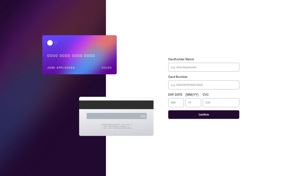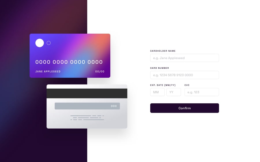
Design comparison
Please log in to post a comment
Log in with GitHubCommunity feedback
- @khaduj03
Nice work and clean design! However, when we confirm the cart, it should show a 'Thank You' modal, but it doesn't. Also, I think when we enter a number that exceeds the limit, it should show an error instead of clearing the input. This could make users uncomfortable, as they need to be extremely careful with the input. If one number is entered incorrectly, all the other correct numbers get cleared. In my opinion, showing an error would be a better approach. But overall, great job!👏
Marked as helpful
Join our Discord community
Join thousands of Frontend Mentor community members taking the challenges, sharing resources, helping each other, and chatting about all things front-end!
Join our Discord
