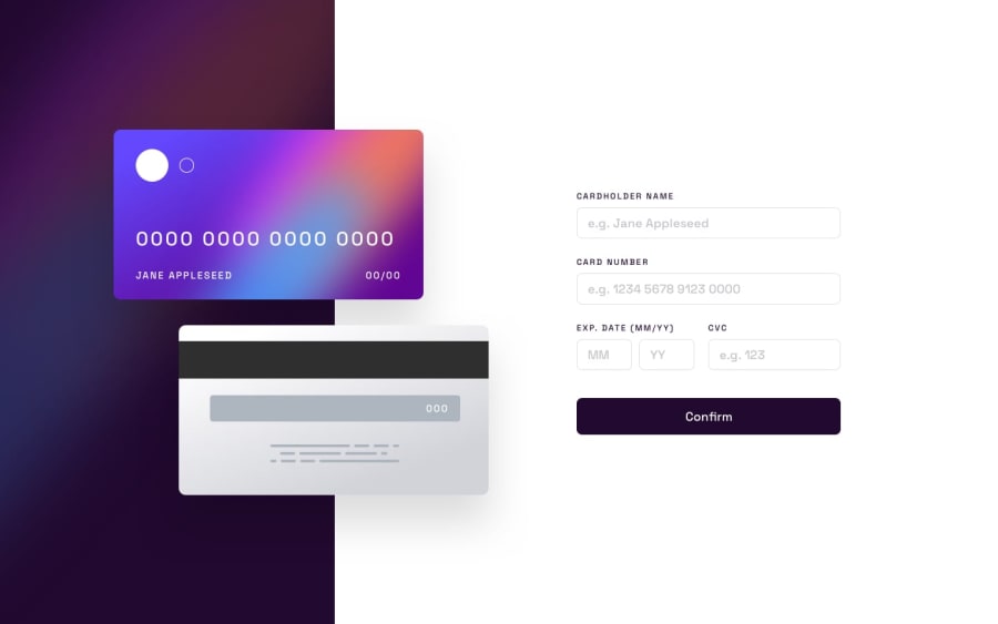
Design comparison
Solution retrospective
I feel like I had to write a TON of code for this one. Looking for any feed back to simplify it, in all forms (HTML, CSS and Javascript).
Also looking for feedback on how people go about building out the main site and then mobile site. I feel like I have to totally rewrite everything to structure the mobile version.
Community feedback
- @ms097530Posted about 2 years ago
As far as CSS goes, I would recommend approaching the styling from a mobile-first perspective. This can simplify the layout as oftentimes the styling for the mobile version overlaps with the default styling in the browser (i.e. stacking content in a single column). I think this will help with your feeling of having to rewrite everything to structure the mobile version.
I think it would also be helpful to create a single error class since each error class has the exact same styling. You could give each error a class of error and instead assign them ids for ease of selection in JS. If you're looking to get rid of the form text shifting when an error occurs you could replace
display: none;withvisibility: hidden;as this will reserve space for the content but make it invisible until changed tovisibility: visible;.Cheers, Mike
Marked as helpful0
Please log in to post a comment
Log in with GitHubJoin our Discord community
Join thousands of Frontend Mentor community members taking the challenges, sharing resources, helping each other, and chatting about all things front-end!
Join our Discord
