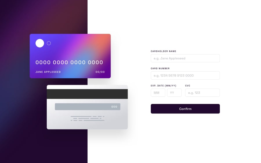
Design comparison
SolutionDesign
Solution retrospective
What are you most proud of, and what would you do differently next time?
I'm mostly proud of my Javascript code. I've just started learning it, and I guess I'm doing a great step through it.
What challenges did you encounter, and how did you overcome them?I had to work on positioning the cards, which was quite challenging, especially when transitioning from the mobile to the desktop version. It took me about an hour to get the code right.
What specific areas of your project would you like help with?I would really appreciate feedback on how clear and organized my code is. If you have any better ideas for positioning the cards, I would greatly appreciate it!
Please log in to post a comment
Log in with GitHubCommunity feedback
No feedback yet. Be the first to give feedback on Dhia's solution.
Join our Discord community
Join thousands of Frontend Mentor community members taking the challenges, sharing resources, helping each other, and chatting about all things front-end!
Join our Discord
