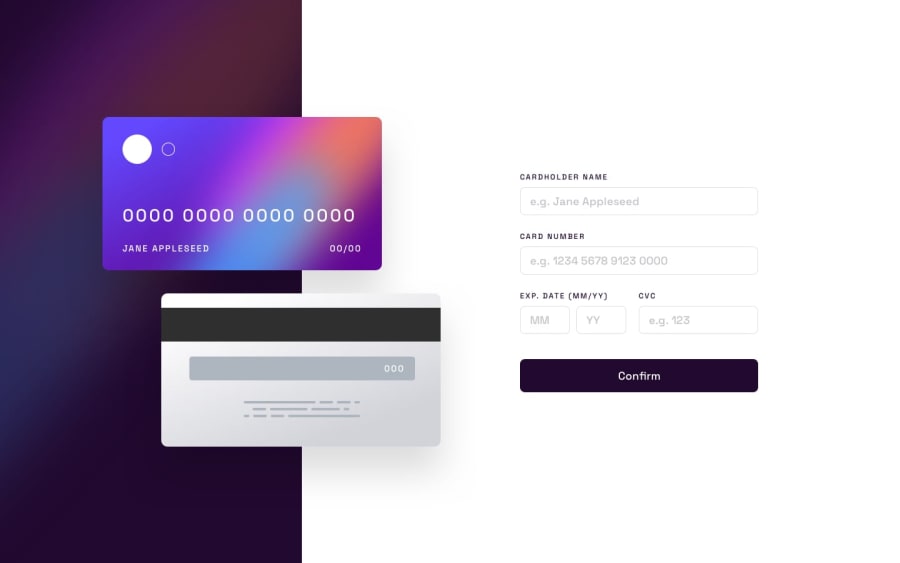
Design comparison
Solution retrospective
I am most proud of successfully building a responsive and functional card validation form with animations. I integrated key features like error handling, input formatting, and form validation, making it visually appealing and user-friendly.
Next time, I would focus on optimizing the validation logic further and exploring advanced animations to make transitions even smoother.
What challenges did you encounter, and how did you overcome them?Validation Logic: Ensuring the card number accepted only numeric input while providing accurate error messages was tricky. I resolved this by using regular expressions and carefully testing edge cases. Responsiveness: Adjusting the layout for both desktop and mobile views required careful planning, but I overcame this using Tailwind CSS and testing on multiple devices.
What specific areas of your project would you like help with?I would love feedback on:
Improving the responsiveness further, especially for smaller screens. Optimizing the animations for better performance. Suggestions for enhancing the code structure or readability.
Community feedback
Please log in to post a comment
Log in with GitHubJoin our Discord community
Join thousands of Frontend Mentor community members taking the challenges, sharing resources, helping each other, and chatting about all things front-end!
Join our Discord
