Design comparison
SolutionDesign
Solution retrospective
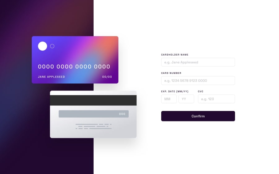
I have implemented validation for this using card-validator. for styling i have used Tailwind css. I think there is some alignment issue here. Suggestion for improvement will be appreciated. This is my First solution on Frontend Mentor
Community feedback
Please log in to post a comment
Log in with GitHubJoin our Discord community
Join thousands of Frontend Mentor community members taking the challenges, sharing resources, helping each other, and chatting about all things front-end!
Join our Discord
