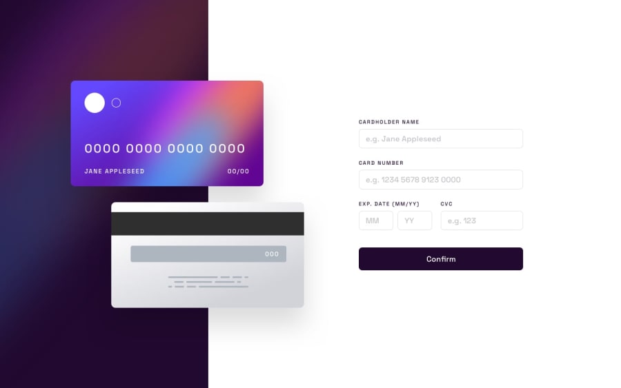
Design comparison
Community feedback
- @AlbertooMunozzPosted almost 2 years ago
Hi, Debjit Datta, I congratulate you for your contribution to this challenge😎. The responsive is incredible but the card number input has an error and it marks that it is wrong despite having all the numbers 🤔. The expiration input are not controlled. You could use 'date' to control that they are correct dates
1@deb1401jitPosted over 1 year ago@AlbertooMunozz Thank you so much for taking the time to try out my solution and provide feedback. I really appreciate it. I will definitely look into the card number input issue you mentioned and update the code accordingly. Also, thanks for the suggestion about using 'date' to control the expiration input.
0
Please log in to post a comment
Log in with GitHubJoin our Discord community
Join thousands of Frontend Mentor community members taking the challenges, sharing resources, helping each other, and chatting about all things front-end!
Join our Discord
