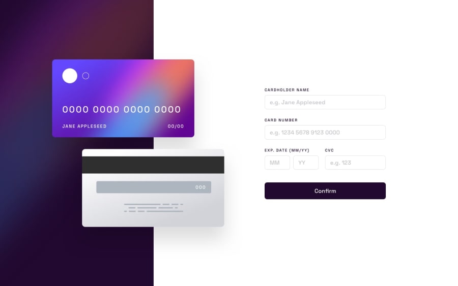
Design comparison
Solution retrospective
Hello, here is my solution for this challenge :)
I'm pretty proud of the way my website looks compared to the original design ! Also, I think that I have done the JavaScript side well (check all inputs, display the errors, etc...). Finally, I added a small animation on cards (front & back) when the user submit the form thanks to "pseudo-elements".
What challenges did you encounter, and how did you overcome them?In my opinion, responsiveness could be improved. In fact, I used a lot of "media queries" and all sizes are fixed with pixels.
What specific areas of your project would you like help with?I think that I need help concerning responsiveness... Maybe that my code is not relevant for that ? For now, I don't know.
I will take all the help you give me :) Thank you.
Community feedback
Please log in to post a comment
Log in with GitHubJoin our Discord community
Join thousands of Frontend Mentor community members taking the challenges, sharing resources, helping each other, and chatting about all things front-end!
Join our Discord
