@elaineleung
Posted
Hey Eduardo, this was well done I think, and yes, great job with the validation! It was able to detect the year number input I entered was invalid, which is good 😄
Two thoughts I have when playing around with this:
-
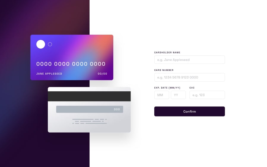
You mentioned about positioning being difficult (well for me it's difficult almost every FEM challenge 😅). I see that the cards shift in the mobile view when the browser size is changed, and I also see that you used the purple background as the body background instead, and so in the mobile view, I can especially see how the cards are separated from the background. Have you tried using just two containers, and not putting the purple on the body background? That way, you might be able to have the cards in the left container for desktop view and still have the cards be positioned in relation to the container rather than leaving the container when the browser size shifts. I think that's something I would try when I attempt this challenge.
-
I see that you added a green outline for the validation as well; I don't know whether that's part of the challenge or not since I don't remember seeing it in the other solutions I saw, but in any case, it's a bit bright, and as a user I think it's enough to see just the red, in that, you'd want the user to only focus on what is the problem and fix it; for me, it's not too necessary to show the green outline since there's no problem with it and no need to focus on it.
That's all I have for now, great job putting everything together, and I'm glad you learned lots from Stack Overflow!
Marked as helpful
@KTrick01
Posted
@elaineleung Hi! Thanks for taking the time to leave your feedback, about the background image I think its fixed now, it took some time and tinkering to change things, but now it looks a lot better, it was worth it! And you're right about the green outline, it is not in the design guide, but I was using it when I was "debugging" the validations and after many hours seeing it there I thought it was part of the design 😅 It's removed now, thanks again!

