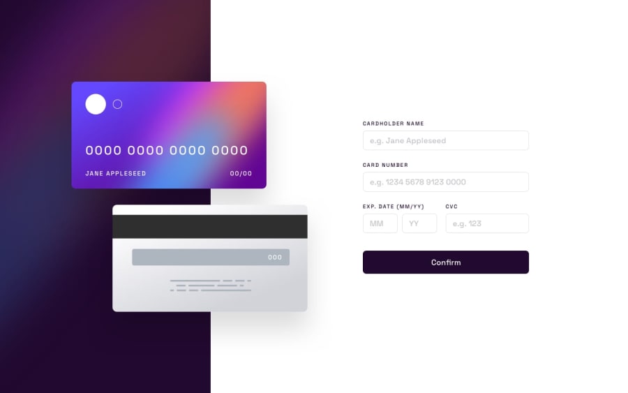
Design comparison
Solution retrospective
I didn't anticipate there being so many potential hiccups when entering names and numbers e.g. character limits, old dates, spacing for the card number. Still, it was a good test of patience and perseverance.
Community feedback
- @kabir-afkPosted about 1 year ago
Hey, can't really help with testing the site since it doesn't open at first place ,but you can try changing the repo name to something diff since interactive-card-details in the URL does make it look like a phishing site....rename it to something diff like details-form and then maybe we can work on your so called potential hiccups
0@Salt-n-vinegarPosted about 1 year ago@kabir-afk Yes, changing the name is a good idea, thanks. However, there are now no "potential hiccups," as I thrived and absolutely smashed the challenge out of the park. On to the next challenge!
0
Please log in to post a comment
Log in with GitHubJoin our Discord community
Join thousands of Frontend Mentor community members taking the challenges, sharing resources, helping each other, and chatting about all things front-end!
Join our Discord
