Design comparison
SolutionDesign
Community feedback
- @raheelahmed99Posted about 2 years ago
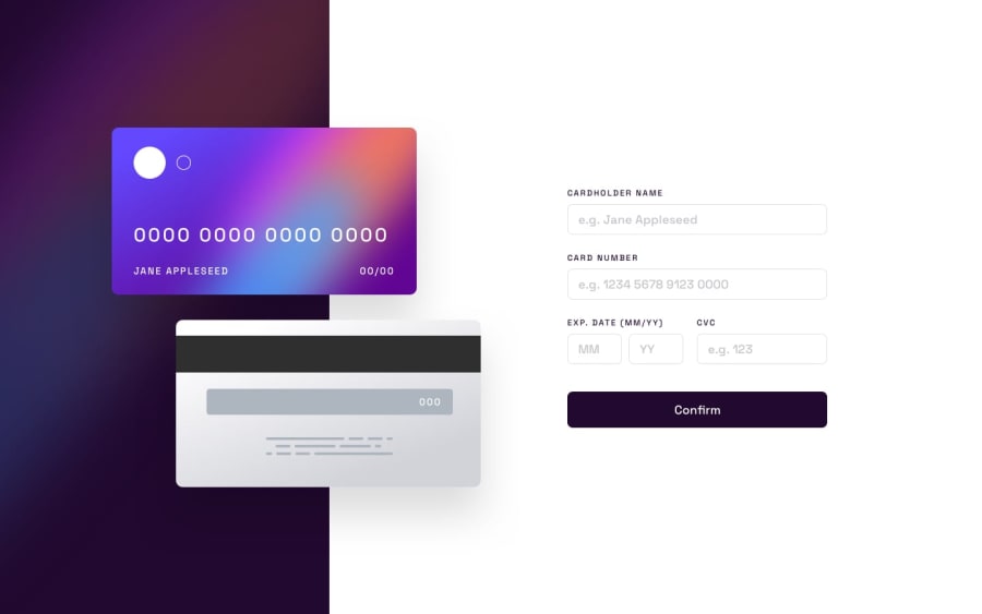
you have made great and build logic good, but it seems like higher pixels of width and height of card and form sections. Input field of month must be value range of 1 to 12. You have missed display thanks section after pressing confirm button. Good luck !
0
Please log in to post a comment
Log in with GitHubJoin our Discord community
Join thousands of Frontend Mentor community members taking the challenges, sharing resources, helping each other, and chatting about all things front-end!
Join our Discord
