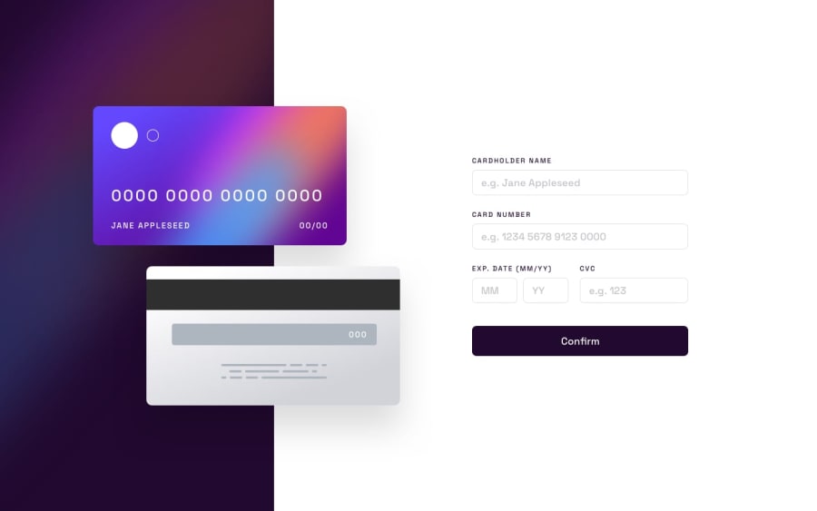
Design comparison
Solution retrospective
A Página não está responsiva, ou seja, a estética só fica legal no computador. Ainda estou aprendendo então relevem algumas coisas. Deixem a opinião de vocês para que eu possa melhorar.
The Page is not responsive, i.e. the aesthetics is only legal on the computer. I'm still learning, so take a few things back. Leave your opinion so I can get better.
Community feedback
- @superpooperxxxPosted almost 2 years ago
Hi, good job on trying to accomplish this not easy task🔥
Really important notes
-
As not all programmers speak your language, please make sure you name your repository and everything in code in English. (every class, etc.)
-
I like how you make notes to navigate in your code.
To improve the readability of your code I highly recommend to format huge lines of code like this ⬇️
❌ <input type="text" name="f_cnumber" class="f_cnumber" placeholder="XXXX XXXX XXXX XXXX" minlength="19" maxlength="19"> ✅ <input type="text" name="f_cnumber" class="f_cnumber" placeholder="XXXX XXXX XXXX XXXX" minlength="19" maxlength="19">- If you want each input to be on new line better use css display: block, than <br><br>
I recommend you concentrating on easier tasks to master basic styling. Don't worry, it is OK to start from basics.
Happy coding❤️ Hope this was helpful
0 -
Please log in to post a comment
Log in with GitHubJoin our Discord community
Join thousands of Frontend Mentor community members taking the challenges, sharing resources, helping each other, and chatting about all things front-end!
Join our Discord
