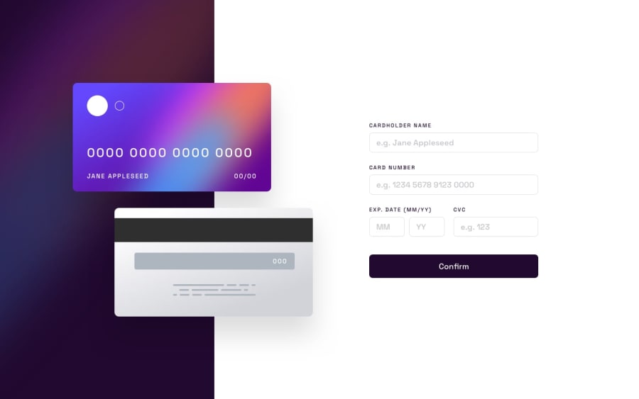
Design comparison
Solution retrospective
This is an interactive credit card validation form.
I used create-react-app for building the project. I used formik and yup for the checking the validation of the credit card details.
What I found most difficult while building the project is the responsiveness. I am still working on my HTML and CSS skills. If you have any advise and feedback for me, they are very much welcome.
Community feedback
- @Biki-dasPosted about 2 years ago
Try to build the same without react, react seems to be an overkill for this type of work according to me as there is not a lot of state to manage in the whole app, if you think in a broader term , the app only has a form where we pull the data from and inject those values on the card image that's it and you can try to do this with vanilla Js. here is mine with vanilla Js - https://creditcardadd.netlify.app/
Marked as helpful0 - @PeshwariNaanPosted about 2 years ago
Hello Fe - great work on completing the challenge. It looks really good.
-
As for the responsiveness, everything looks good for this project because the layout is so simple so I wouldn't change anything. It's always best practice to keep things as simple as possible. I do see that you had the breakpoints in your app.css code which is great even though you didn't use them. As the designs get more complex you will.
-
Also if you want to get rid of the landmark warnings just wrap a
<main>tag around your root div in the index.html file like this:
<main>
   <div id="root"></div>
</main>
Happy coding
Marked as helpful0 -
Please log in to post a comment
Log in with GitHubJoin our Discord community
Join thousands of Frontend Mentor community members taking the challenges, sharing resources, helping each other, and chatting about all things front-end!
Join our Discord
