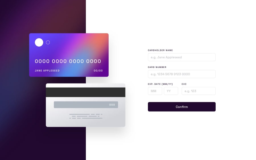
Design comparison
SolutionDesign
Solution retrospective
This is my solution for the Interactive Card Details Form Component.
It was overall easy and enjoyable building this project, however I faced some difficulties regarding appearance and functionality:
- First of all, I would be open to suggestions regarding how to address mobile responsiveness as I can't fix the
heightof.card-section(it remains the same). Bear in mind this is an<aside>element. - Secondly, I want to figure out how to add form validation. I mainly use React and Formik however they occupy a lot of space for a simple app inside a website so I would like to achieve it using vanilla JS. I have already inserted some starting code for the
#cardNumber<input>however it's not efficient. I have also interacted with other solutions such as adding an.error-message<div>inside every<input>but still without luck. - I would also like to learn how to change
bordercolor (I use Bootstrap for default styling). While I have defined a class, specified a value and marked it as!importantit doesn't produce any fruitful result. - Lastly, tell me how to fix the bug regarding
.exp-date-yy-frontspan, as when I insert a value on it (f.e.23) it returns2300instead of23.
I would appreciate your feedback and would like to receive your comments and perspectives regarding the project. Thanks a lot!
Community feedback
Please log in to post a comment
Log in with GitHubJoin our Discord community
Join thousands of Frontend Mentor community members taking the challenges, sharing resources, helping each other, and chatting about all things front-end!
Join our Discord
