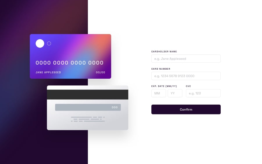
Design comparison
SolutionDesign
Solution retrospective
The JavaScript code is a bit spilt, I still need to work on a more bounded form of code.
Community feedback
- @KrishnaVishwakarma1595Posted about 1 year ago
Hi, @mslysz
I have got a few points for you to improve in your solutions.
- I think your design has got an unnecessary
margin: 100px autoin your media query. I don't know why you keep it but you should remove that margin so that your design keeps the whole screen width & height. - Also, on the same media query you've set a width & height of
height: 903px; width: 1440px;. You can keep thewidth: 100%/autoso it covers full-screen width and for the height, you can giveheight: 100vhfor full-screen height. Try to avoid giving a static width or height to the elements, especially for the body or your main container. - When I try to submit an empty form it just shows me an error message for the first field, and if I fill this and submit it again it shows an error message for the next field. Instead, you should show error messages for all the fields on submit for a better UI/UX experience for the users. And when the user changes the input you can hide them again.
- For the HTML part start using Semantic elements like
<header>, <main>, <section>, <aside>, <footer>and more with HTML accessibility rules. - For the CVC input field, you should have used
type="password"as CVC is a secure key/password of any card, which the user doesn't want to show to anyone. If you want you can also give an eye icon or something by which the user can switch the input type to text or vice-versa, but it depends on the use case if someone wants this kind of functionality. Mostly we avoid it.
I hope these points will help you. If you have any other query or doubt you can reach out to me anytime. Although, the design is looking nice. Keep mentoring :)
Marked as helpful1 - I think your design has got an unnecessary
Please log in to post a comment
Log in with GitHubJoin our Discord community
Join thousands of Frontend Mentor community members taking the challenges, sharing resources, helping each other, and chatting about all things front-end!
Join our Discord
