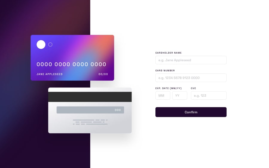
Interactive enter data of bank card on ReactJS
Design comparison
Solution retrospective
The main problem is figma elements, that are a bit uncomfortable. I could write logical stuff for 1 day, but adaptive layout was freekly diffucult.
As I mentioned earlier, my layout is not very well for tablets (it looks okay on Phones and Desktops).
I would like you give me some pieces of advice after visiting my site :) Thanks for paying attendion!
Community feedback
- @sulemaan7070Posted almost 2 years ago
hey Adam Esmurziev😄, I have visited your site and here are a few tips to make it better
1.The size of the
card-images
can be bigger on the desktop version.2.Limit the number of characters to be accepted by the input field 16 in the case of
card number
.3.limit the number of characters to 2 in the
MM and YY
fields and 3 in the case ofCVC
.4.use
cursor:pointer
on the confirm button.Happy coding👍🏻🔥💯
1@EsmurzellyPosted almost 2 years ago@sulemaan7070 hi :) Thanks for your review You are right about
card-images
, I should have made it bigger Also I wanted to make validation harder that's why I set limits (these limit are in my country) I have forgotten aboutcursor:pointer
, my badThanks a lot :)
1 - @superpooperxxxPosted almost 2 years ago
Hi, good job on making this project🔥 It is not easy, so don't get discouraged
I would definitely recommend you first concentrate on your CSS skills and try to remaster this project using CSS Grid as the layout in figma built with 12-column grid.
Grid settings would take 10 rows at most, but you can achieve beautiful layout that is easy to adapt for different devices.
I have done this project, so you can study my solution of it. One thing to notice, I used SASS instead of styled components, but you still can open my solution in Mozilla dev tools to see where and how I implemented grid.
If you have any questions, you are welcome!
Happy coding❤️ Hope this was helpful
1@EsmurzellyPosted almost 2 years ago@superpooperxxx Hi! Oh thanks for your review
Usually I use Flexbox therefore my Grid skills are lower but I think it's not too hard compared to Flexbox.
I've just watched your project, it's very well! I gonna try to remaster my layout due to Grid. Also I understand SASS (I write on this too) that's why I won't have any troubles with this.
Can I send you my remastered project in the future if you don't mind?
Thanks a lot for your review :)
0
Please log in to post a comment
Log in with GitHubJoin our Discord community
Join thousands of Frontend Mentor community members taking the challenges, sharing resources, helping each other, and chatting about all things front-end!
Join our Discord