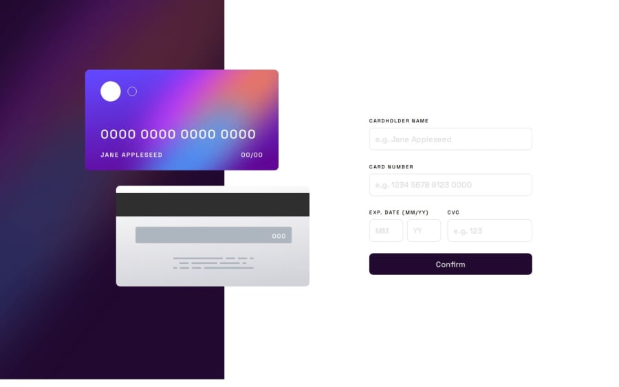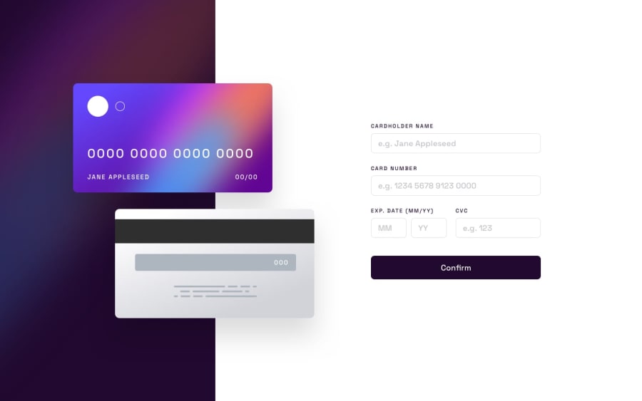
Design comparison
SolutionDesign
Solution retrospective
What challenges did you encounter, and how did you overcome them?
This is the most complicated fron-end mentor task I've solved so far. The positioning of the cards, the responsive design and the form validation were big challenges. There are literally thousands of ways to make the positioning and I decided to go with CSS grid for the big screens (>800p) and flex for the mobile devices. I'm not sure it is the right way, but It seems to work.
Please log in to post a comment
Log in with GitHubCommunity feedback
No feedback yet. Be the first to give feedback on Georgi Tashev's solution.
Join our Discord community
Join thousands of Frontend Mentor community members taking the challenges, sharing resources, helping each other, and chatting about all things front-end!
Join our Discord
