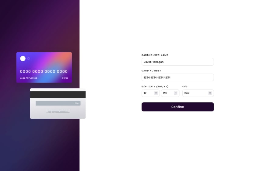


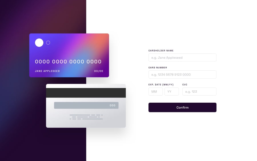
Design comparison
Solution retrospective
-
Could I please get some help with making the cards responsive across viewports, rather than setting fixed media queries as I attempted and still failed?
-
This is my best looking JavaScript ever, I tried a bunch of things within this form validation, any tips regarding the structure, modules, type of functions used in modules, control flow-related comments are much appreciated as well!
Rant: The thing I had most trouble with were the 2 cards and their offset. I couldn't make it responsive even after asking help in the slack channel. I had a blueprint with grid and flexbox, but somewhere along following it I got lost and nothing would work.
I spent several (excited) days trying out very beginner-like non-DRY code to refactoring the JavaScript to its current form, but CSS seems to get increasingly more frustrating as the scattered dots called JS terms begin to connect in my head.
Community feedback
Please log in to post a comment
Log in with GitHub
Join our Discord community
Join thousands of Frontend Mentor community members taking the challenges, sharing resources, helping each other, and chatting about all things front-end!
Join our Discord