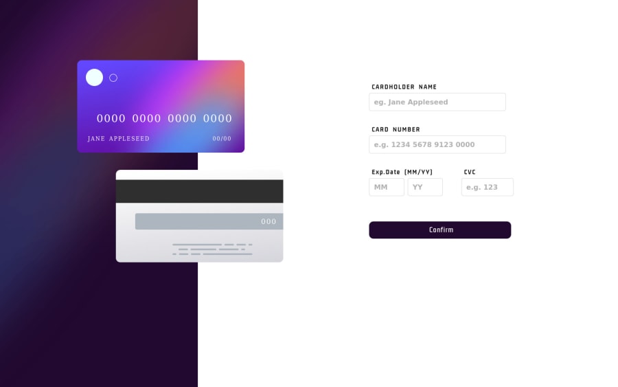
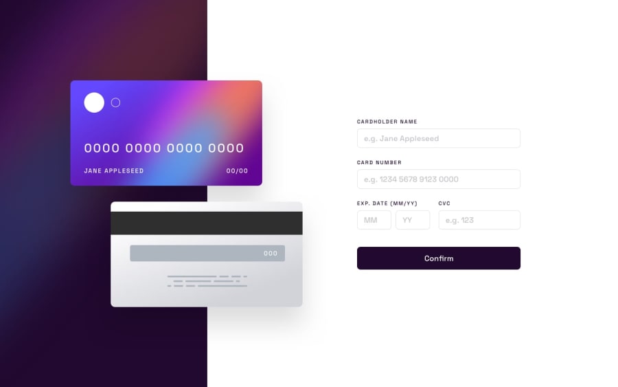
Not Found
Not Found
Not Found
Not Found
Not Found
Not Found
Not Found
Not Found
Not Found
Not Found
Not Found
Not Found
Not Found
Not Found
Not Found
Not Found
Not Found
Not Found
Not Found
Not Found

Submitted

Interactive Card Details Form

@HameezAqeel

Desktop design screenshot for the Interactive card details form coding challenge

This is a solution for...

  • HTML
  • CSS
  • JS
2junior
View challenge

Design comparison


SolutionDesign

Solution retrospective


Is there any way that I can make it more responsive using more of flexbox and less of media queries? Any kind of help or tip might be useful for a beginner like me.

Community feedback

@mark-gardner74

Posted

Hi,

You can make it more responsive using flexbox, easy to swap between flex-direction to make things easier to reuse. Your code is solid, very solid for a beginner in JS, must be some other programming in the past.

One tip and it is really the one that I swear by. Mobile-first. You define everything to work on mobile. Even to the extent of trying a fixed screen width of 375px for the first attempt. Design and code the mobile version and then add breakpoints (media queries) for 768px and 1024px (possibly 1440px). When you design mobile-first you will only ever be changing the bits that need changing not scaling down to a lesser screen size.

Secondly, when you design mobile-first you can see which elements of code you can group together in flexbox/grid for when you scale up. In this example the card details / main section start in mobile as flex-direction: column and then switch to row. Once you have defined something, you only need to change the bits you want to override.

Great attempt and good luck with the next one.

Marked as helpful

1

@HameezAqeel

Posted

@mark-gardner74 Please accept my heartiest thanks for your feedback Mark. I am sure you wouldn't mind answering my couple of queries. They might be very helpful for a beginner like me.

  1. Do I need to write media queries for all four device widths? I mean isn't there any way I can reduce my CSS?

  2. Since you have appreciated my JS code, I would like to know if you feel my JS knowledge and fundamentals are good enough to start learning a framework or should I stick with JS for the time being?

    Will be waiting for your helpful feedback.
    

Regards.

0

@HameezAqeel

Posted

@mark-gardner74

Thanks a lot Mark for your insightful feedback. I am sure you wouldn't mid responding to a couple of queries of mine. They might be very helpful for a beginner like me.

  1. Is there a way I can reduce my CSS that has gone long due to the media queries or should I write media query for every device width?
  2. Since you have taken a look at my JS code, do you feel my fundamentals and knowledge is good enough to try my hands on a framework or should I continue to stick with Vanilla JS?

Waiting for your helpful feedback. Regards.

0

@mark-gardner74

Posted

Hi,

When it comes to media queries you can have examples like:

:root { --background-color: #F00; }

.class { display: flex; flex-direction: column; height: 40em; justify-content: space around; color: white; background-color: var( --background-color ); }

@media screen and ( min-width: 768 ) {

:root { --background-color: #00F; }

.class { flex-direction: row; height: 20em; } }

Now above flex-direction changes to flex-direction: row at 768px. You will not need anything at 1024px unless you have designs on changing the direction again. The background colour changes because of the variable --background-color

You still have the media queries but change what you need to change. Use classes as far as possible. An ID is for something absolutely specific. Classes can be split up to perform fewer operations. You then have more classes, but you have more opportunities to mix and match which leads to smaller CSS files. Take a look at the principles behind Tailwind and Bootstrap.

With regards to moving to a framework. No, not yet. Whilst Frameworks are a desirable part of future employment, vanilla JS is a big part of most of them. You cannot get by in React without it. Get the know the DOM well, and how to manipulate arrays and objects. Keep going through these projects, then revisit your code in 6 months' time. You will note two things, 1: your code now whilst good is probably doing more than it should do; and 2: You will be nothing but heartened with your progress. I have been coding for a while, constant improvement is key and keeps you going.

All the best.

Marked as helpful

0

Please log in to post a comment

Log in with GitHub
Discord logo

Join our Discord community

Join thousands of Frontend Mentor community members taking the challenges, sharing resources, helping each other, and chatting about all things front-end!

Join our Discord