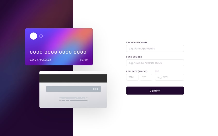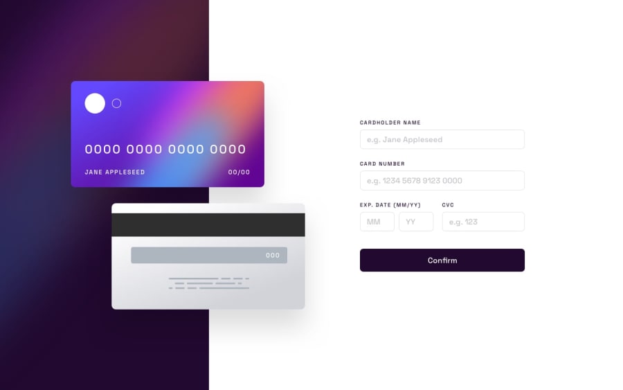
Design comparison
Solution retrospective
👾 Hello, Frontend Mentor coding community. This is my solution for the Interactive card details form.
Feel free to leave any feedback and help me improve my solution or make the code clean!✨❤️
By far my worst submition here, code is a total mess and filling the form in small screen sizes was simply awfull, but here I am... the validation part was a headache and it sure has tons of bugs, but I learned a bit more on key related events. Also there was something that I couldn't do, the inputs when on focus are supposed to have a border with linear gradient from top to bottom, if you know how to do it please let me know. I definitely want to try this challenge again from scratch, any feedback is appreciated, I need to recover XD
Community feedback
Please log in to post a comment
Log in with GitHubJoin our Discord community
Join thousands of Frontend Mentor community members taking the challenges, sharing resources, helping each other, and chatting about all things front-end!
Join our Discord
