Design comparison
SolutionDesign
Solution retrospective
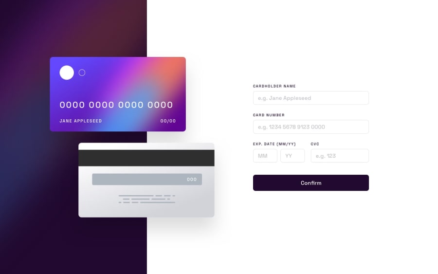
- I found it difficult handling the different positioning of the cards and the inputs inside them
- I'm unsure of how I'm passing props. I think maybe using Redux would have been good but I didn't want to do an overkill
- How do I improve my CSS to handle all the absolute and relative positioning. A course, YouTube video or tutorial would be highly appreciated.
Community feedback
Please log in to post a comment
Log in with GitHubJoin our Discord community
Join thousands of Frontend Mentor community members taking the challenges, sharing resources, helping each other, and chatting about all things front-end!
Join our Discord
