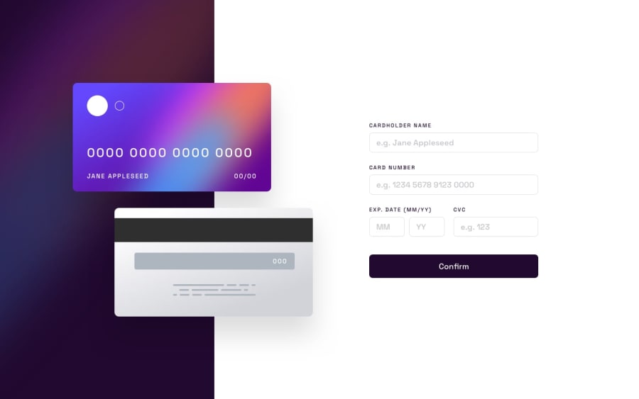
Design comparison
Solution retrospective
I feel like there could have been a better to implement this project. Any ideas? Also i don't like how it looks on devices with a large viewport but I didn't know how to optimize the design to fix that.
Community feedback
- @AngeloMar98Posted over 1 year ago
I really like this solution, regarding the card image, you opted to use pixels for everything, which is a good idea since it's not that important for the font to scale there. And I'm really surprised by how the input bordered is made on focus, I didn't even know background had those options! One thing, which is very small, center the credit card number more to the right for desktop, other than that this solution is better than mine in every way, I really liked it
Marked as helpful0@noneofurbuzzPosted over 1 year agoThank you so much for the tip about centering to the right for desktop! and i'm glad you liked my solution even though I feel like it wasn't the best.
1
Please log in to post a comment
Log in with GitHubJoin our Discord community
Join thousands of Frontend Mentor community members taking the challenges, sharing resources, helping each other, and chatting about all things front-end!
Join our Discord
