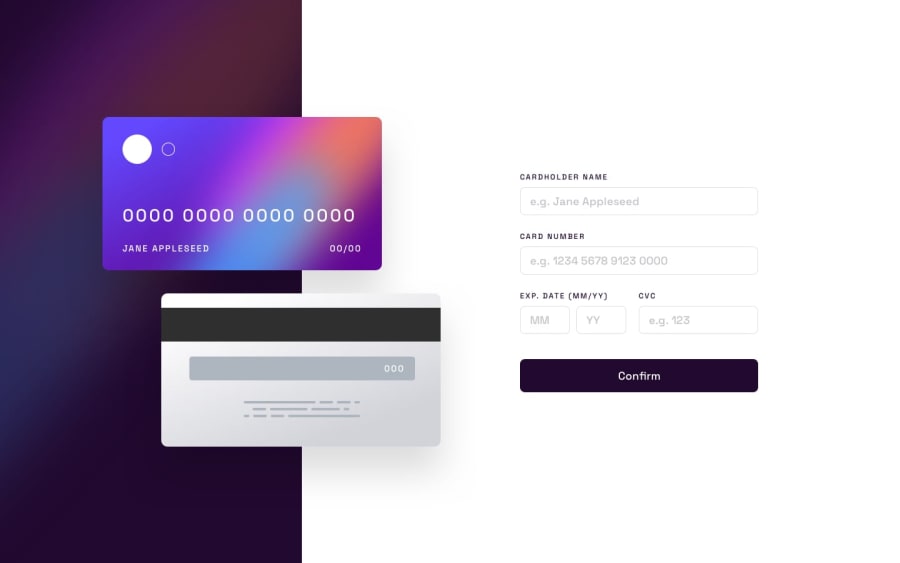
Design comparison
Solution retrospective
Day 5 of 1 challenge a day. Unfortunately, I can't exactly say it was one a day, this challenge actually took me 3 days to get to the state it's at now. And I'm not satisfied. There were a lot of hurdles I had to overcome, and the major part of that is javascript. This challenge really had to make me learn and research it enough, but that being said, I still need a lot of work to really improve my JS code. While JS was an issue, the next issue was my solution to the floating cards. Even though I had a plan of attack for it, it seemed to not go the way I had anticipated. I had to rely a lot on position: absolute again, and I just couldn't figure out what to do. This leads into my next issue, that being my site appears to be broken on mobile safari. I can't really seem to understand why as the emulator on Firefox seemed to be fine, so that's just another unfortunate part of this.
That being said, I enjoyed this challenge. I hope to get some kind of feedback and recommendation for writing better JS and help with understanding how to do the cards better.
Thanks
Community feedback
Please log in to post a comment
Log in with GitHubJoin our Discord community
Join thousands of Frontend Mentor community members taking the challenges, sharing resources, helping each other, and chatting about all things front-end!
Join our Discord
