Design comparison
SolutionDesign
Solution retrospective
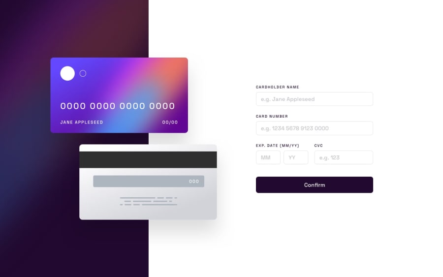
Handling the text on image was by far the hardest part of this challenge, what helped was setting the text with a max-width. Still, wasn't able to give borders and error messages to the form, overral I'm happy I managed to get it to this point and I'm dying to see what other people came up with. This challenge I am the least satisfied with but was the most fun
Community feedback
Please log in to post a comment
Log in with GitHubJoin our Discord community
Join thousands of Frontend Mentor community members taking the challenges, sharing resources, helping each other, and chatting about all things front-end!
Join our Discord
