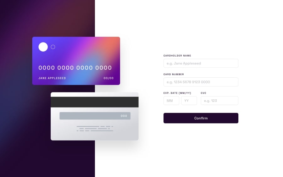
Design comparison
Solution retrospective
can you have any suggestions welcome
Community feedback
- @javascriptor1Posted 12 months ago
Nice job Oussama. Here are some quick notes as I just uploaded my solution an hour ago:
1- Always use semantic tags instead of generic ones like div. Use the form tag instead of div and use footer tag instead of section for the footer note.
2- Your JavaScript logic for input checking does not work well. Month and year fields accept letters, not digits. Try to type letters "DD" in the month input field and it won't show errors. In addition , if you type for example 13 in month field , it will show the wrong error message about blank field despite the field is not blank but contains invalid month. Change the error message.
3- add border color for input while in focus status.
4- The year format is wrong. It should be 2 digits only (YY) as shown in the challenge. You made it in YYYY format which is not correct.
5- In mobile screen (375px) , the footer is overlapping and touching with the confirm button.
6- CVC filed should be wider for smaller screen to edge with top input fields from the right.
Keep coding and good luck
Marked as helpful1
Please log in to post a comment
Log in with GitHubJoin our Discord community
Join thousands of Frontend Mentor community members taking the challenges, sharing resources, helping each other, and chatting about all things front-end!
Join our Discord
