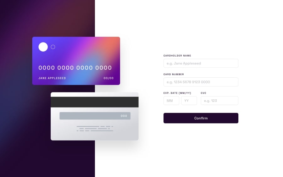
Design comparison
Solution retrospective
Hey there! 👋
For this one I spent over 30hours and it's still far from what I would like it to be, but I have to move on. I would appreciate any advice on how I can:
- position the two cards on the page other than absolute, if any
- ensure responsiveness
- the way i did it is with using
vwfor everything on the cards and it won't work for people who change their default font sizes.
- the way i did it is with using
Community feedback
- @nelsonleonePosted almost 2 years ago
Hello congrats on completing this challenge, 🎊🎊
Here are some tips on positioning , hope it was helpful.
-
Firstly , you can consider building for mobile first, Take a mobile first approach because the mobile setup is not that complicated.
-
Secondly , for positioning, You can have a
<main>tag with two child container divs that will contain the cards and the other for the form. `<main>
you set a position relative on the divs , then you can easily position the cards as you want in there containing block. with
position:absoluteMarked as helpful0 -
- @okraksPosted almost 2 years ago
Hello Andreimaier, Great work done so far!
For positioning the two cards on the page, you can utilize flex
align-items: centerto center the div containing the two cards (along the cross axis that is) See more here in the Mozilla docsMarked as helpful0
Please log in to post a comment
Log in with GitHubJoin our Discord community
Join thousands of Frontend Mentor community members taking the challenges, sharing resources, helping each other, and chatting about all things front-end!
Join our Discord
