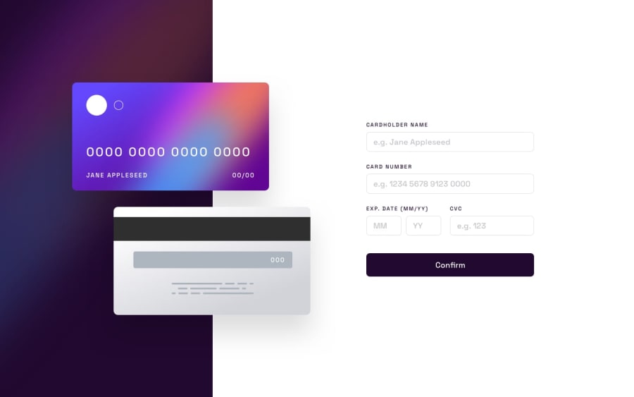
Interactive Card Component with React JS and SASS
Design comparison
Solution retrospective
I am trying to learn React and I want to know how I did on this project.
Community feedback
- @PeshwariNaanPosted almost 2 years ago
Hello Kacey - Nice job on completing the challenge, it looks pretty good.
Here are a couple tips that you might find useful:
-
One thing that I would recommend when using react is making your code more modular. By this I mean breaking things up to even more components than what you currently have. I know this is a very simple project, but it is great coding practice as you evolve and develop more complex applications. This is also the biggest strength of react so you can avoid unnecessary re-renders and have optimum efficiency for your app (Helps a lot with SEO too).
-
You could definitely separate the inputs to their own components and import them into the a separate form component. Now you won't have have a bunch of stuff packed in your app.js and anyone looking through your code can find things easier. This is especially useful when dealing with forms as we use them all over the place and you would be able to reuse your code. Sometimes the validation can get pretty tricky and its nice to not have to rebuild it on the next one. The more generic you can make it, the more robust it becomes.
-
Make your error codes more specific in your validation. If I don't have enough characters in the card number input, the error reads "wrong format, numbers only" when it should give a different error indicating the user doesn't have enough characters. This might not be in the design specs for this project but things like this will save you A LOT of time later on.
I hope this is helpful - Happy coding
Marked as helpful0 -
Please log in to post a comment
Log in with GitHubJoin our Discord community
Join thousands of Frontend Mentor community members taking the challenges, sharing resources, helping each other, and chatting about all things front-end!
Join our Discord
