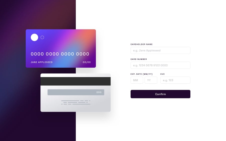
Design comparison
Solution retrospective
feedback is welcome !
Community feedback
- @sulemaan7070Posted almost 2 years ago
hey Katerina Sarantopoulou😄, congratulations on completing the challenge... here are a few tips to make your site better.
1.Limit the number of characters to be accepted in the
card numberinput field to 16.2.limit the number of characters to 2 in the
MM and YYfields and 3 in the case ofCVC.3.once the validation messages start showing, there are not hiding back even though the proper input was given.you site needs to re-evaluate the input fields every time the user clicks on the
confirmbutton.4.The user should be able to see input on the card as soon as he starts typing.. hope you will fix these.. happy coding🔥🔥💯💯
0
Please log in to post a comment
Log in with GitHubJoin our Discord community
Join thousands of Frontend Mentor community members taking the challenges, sharing resources, helping each other, and chatting about all things front-end!
Join our Discord
