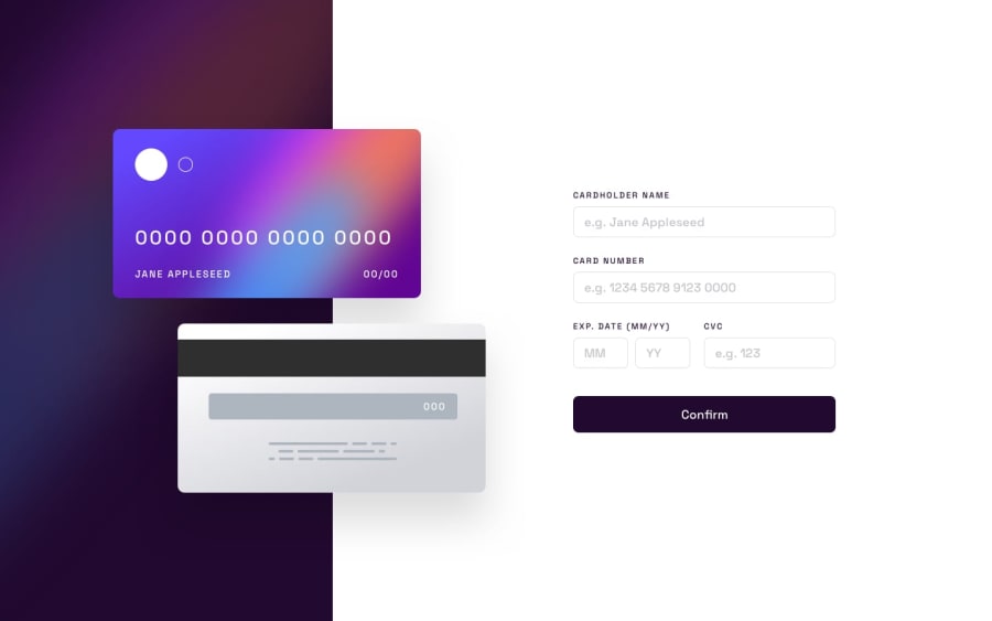
Design comparison
Community feedback
- @sulemaan7070Posted almost 2 years ago
hey Kevin Argumedo😄, congratulations on completing the challenge... here are a few tips to make your site better.
As for design, you did a great job!! functionality vise you can add more validation to the site...
case 1.when I am clicking on
confirmbutton without filling in any input fields only thecard holder name inputfield is showing a validation message.case2.when I am entering text in only
card holder nameand clicking on theconfirmbutton only thecard numberis showing the validation error... when every other element should show the validation error.. hope you will fix thesehappy coding🔥🔥
Marked as helpful1@Kevin-ACPosted almost 2 years ago@sulemaan7070 Hello, thank you for the feedback, I've fixed the error. Any other comments are welcome.
1
Please log in to post a comment
Log in with GitHubJoin our Discord community
Join thousands of Frontend Mentor community members taking the challenges, sharing resources, helping each other, and chatting about all things front-end!
Join our Discord
