Design comparison
SolutionDesign
Solution retrospective
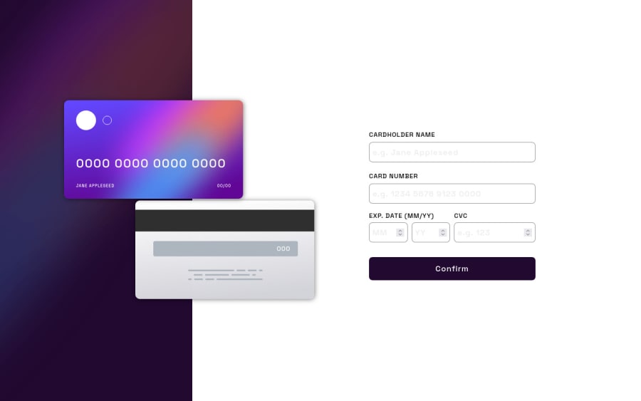
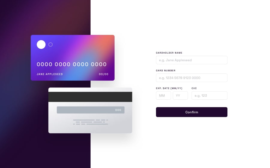
I had a bit of a hard time making the absolute positioning of the credit card front and back images and the text on them appear in the right place. Just wondering if there's a better way to work on their positions.
Community feedback
Please log in to post a comment
Log in with GitHubJoin our Discord community
Join thousands of Frontend Mentor community members taking the challenges, sharing resources, helping each other, and chatting about all things front-end!
Join our Discord
