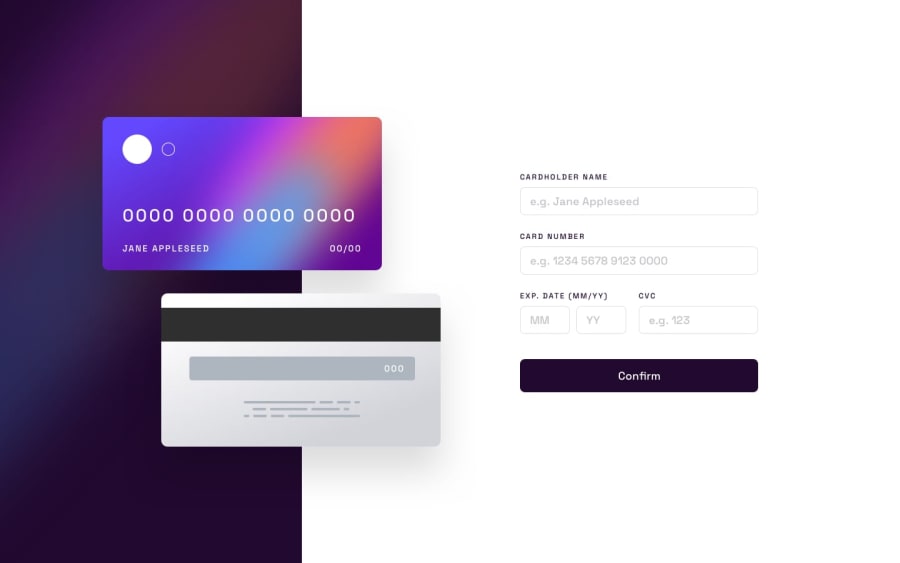
Design comparison
SolutionDesign
Community feedback
- @sulemaan7070Posted almost 2 years ago
hey Glenn😄, great job on completing the challenge.. here are a few tips to improve your site..
1.when I am typing the card number
wrong format or insufficient charecters's validation messageseems to be popping up..You can use a debouncer and only show the message when the user stops typing.. more about debouncing here📚2.Since you have user framer motion use
scaleon the hover of the button..and you can even animate thesvgwhich will appear with thank you..🔥additional tip: when the user is typing the input you can show the input directly on the card..
Hope that helps, happy coding🔥💯👍🏻
0
Please log in to post a comment
Log in with GitHubJoin our Discord community
Join thousands of Frontend Mentor community members taking the challenges, sharing resources, helping each other, and chatting about all things front-end!
Join our Discord
