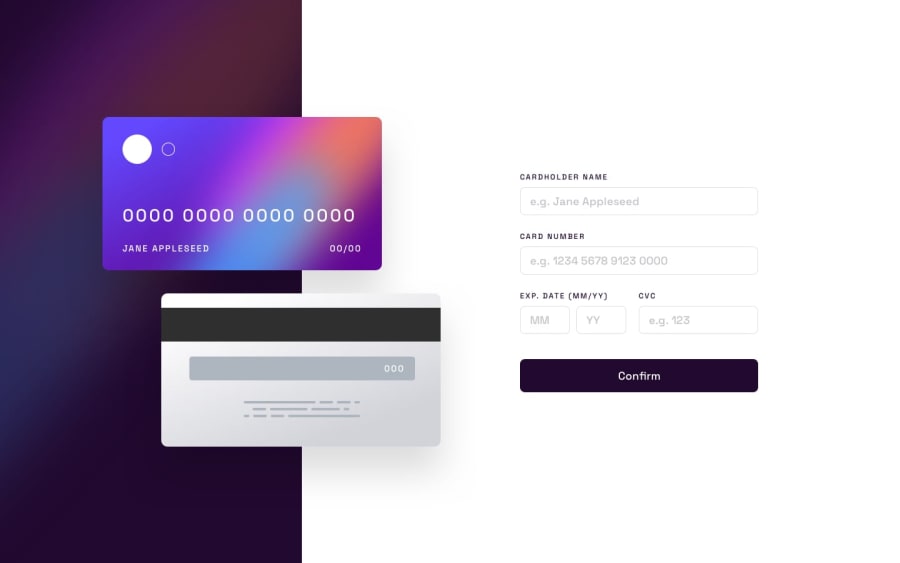
Design comparison
SolutionDesign
Solution retrospective
I successfully finished this challenge and am eager to receive any feedback.
My primary focus was on React.js, so I concentrated my coding efforts on two specific screen sizes:
- Mobile: 375px
- Desktop: 1440px
However, I encountered an issue when the screen width exceeded 375px, for instance, at around 400px. Despite using w-full, which signifies 100% width, the background image didn't align with the expected width.
<img
        className="w-full md:hidden"
        src={mobileBackground}
        alt="purple and reddish-purple color blending together"
/>
Thank you for your time. Happy Coding!
Community feedback
Please log in to post a comment
Log in with GitHubJoin our Discord community
Join thousands of Frontend Mentor community members taking the challenges, sharing resources, helping each other, and chatting about all things front-end!
Join our Discord
