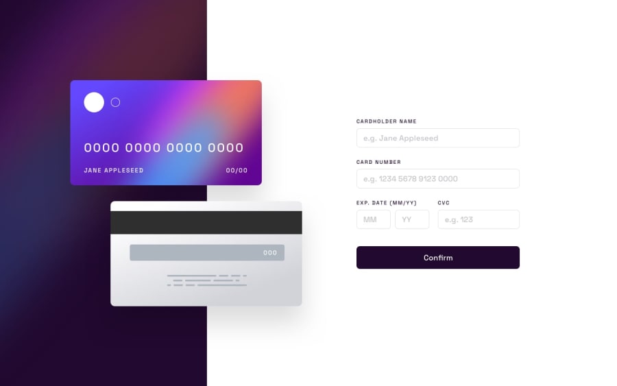
Design comparison
Community feedback
- @sulemaan7070Posted almost 2 years ago
hey @Alucard2169😄, congratulations on completing the challenge here are a few tips to make your site better..
1.When I'm entering the number in the
card numberinput fieldan error message keeps popping up until I complete finishing all the characters requiredAdd a debouncer which will show the validation error only when the user stops typing2.limit the number of characters to 2 in the
MM and YYfields and 3 in the case ofCVC.3.The Input provided by the user should actively reflect on the
cardunlike all changes reflecting in the last.As of styling you did a good job, add these things to make your site better let me know if you need any help happy coding😄🔥💯
Marked as helpful1
Please log in to post a comment
Log in with GitHubJoin our Discord community
Join thousands of Frontend Mentor community members taking the challenges, sharing resources, helping each other, and chatting about all things front-end!
Join our Discord
