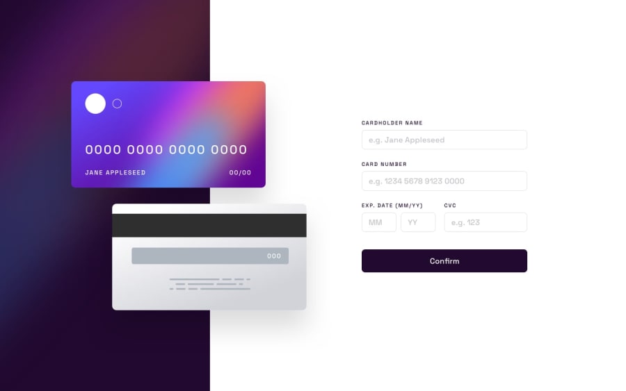
Design comparison
SolutionDesign
Solution retrospective
Hi there ✌️
Feedback welcome
Community feedback
- @mark-gardner74Posted about 2 years ago
Hi, this is very good. The cards sliding in is a nice touch.
A couple of thoughts:
-
Your validation messages appear a little too soon. Wait until you tab out, or go to save and then display them and re-focus on the field if necessary;
-
It was difficult to know when I was getting close to 16 characters with the card number, display it live on the front of the card as you type;
-
Leave a little bit more room for the validation messages, the screen jumps a little when they appear.
Aside from these, really good work. Best of luck with the next project.
Marked as helpful0 -
Please log in to post a comment
Log in with GitHubJoin our Discord community
Join thousands of Frontend Mentor community members taking the challenges, sharing resources, helping each other, and chatting about all things front-end!
Join our Discord
