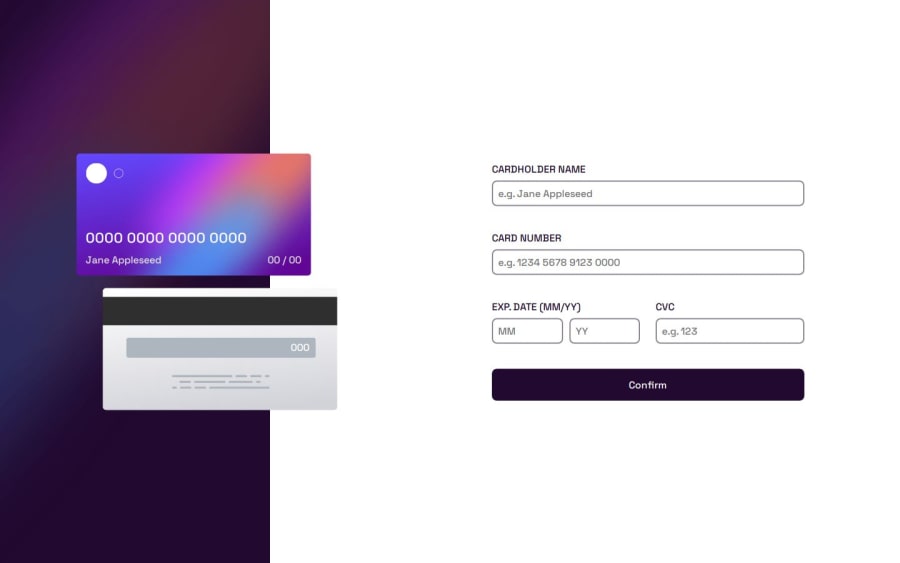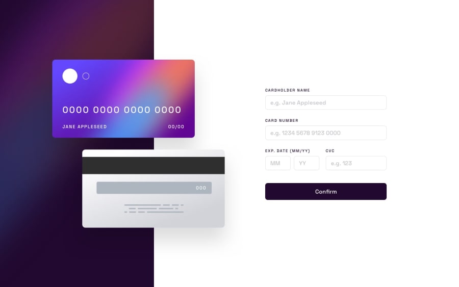
Design comparison
Solution retrospective
I am most proud of the comprehensive real-time validation system that ensures a seamless user experience by giving immediate feedback on input errors. This feature enhances user trust and usability by maintaining consistent and dynamic updates on the UI. Additionally, the project successfully handles edge cases, such as blank fields and formatting errors, which demonstrates robust design. What I would do differently next time would be implementing further optimizations such as card type detection (e.g., Visa, MasterCard) based on the card number, adding animations for smoother UI transitions, and integrating backend logic for storing and processing the form data securely. I would also refactor the code to make it more modular, improving readability and maintainability.
What challenges did you encounter, and how did you overcome them?One of the main challenges was implementing real-time validation for multiple fields in a way that was both user-friendly and efficient. Initially, managing the different validation rules for the name, card number, expiration date, and CVC was complex. To address this, I used a systematic approach, where each field was validated separately but followed a similar structure, making it easier to handle errors and give users instant feedback. Another challenge was ensuring the correct formatting of input fields, such as the card number and expiration date, while also accommodating various user inputs. I overcame this by using regular expressions and string manipulation techniques to clean and format the input dynamically, ensuring that the data displayed matched the expected formats. Lastly, handling edge cases like empty fields and incorrect formats required additional logic to provide clear error messages and visually indicate issues. I used event listeners to check inputs both on focus and focus-out, providing a smooth user experience. If I were to tackle this again, I would optimize the validation logic even further and make the code more modular to improve maintainability and readability.
What specific areas of your project would you like help with?I would like help improving the modularity and scalability of the input validation logic. While the current system works, I believe there’s room for improvement in terms of separating concerns more effectively, possibly by creating reusable functions or a validation class. This could make the code easier to manage, especially as the project grows or if more validation rules need to be added later. Additionally, suggestions on how to optimize the event listeners, so they are more efficient when dealing with multiple inputs, would be valuable. I’m interested in ensuring that the user experience is smooth even when the form becomes more complex, and optimizing performance is key. Finally, guidance on structuring the project for future expansion and ensuring that it remains maintainable as it grows would be helpful. Any advice on best practices for creating scalable, modular JavaScript projects is greatly appreciated.
Community feedback
Please log in to post a comment
Log in with GitHubJoin our Discord community
Join thousands of Frontend Mentor community members taking the challenges, sharing resources, helping each other, and chatting about all things front-end!
Join our Discord
