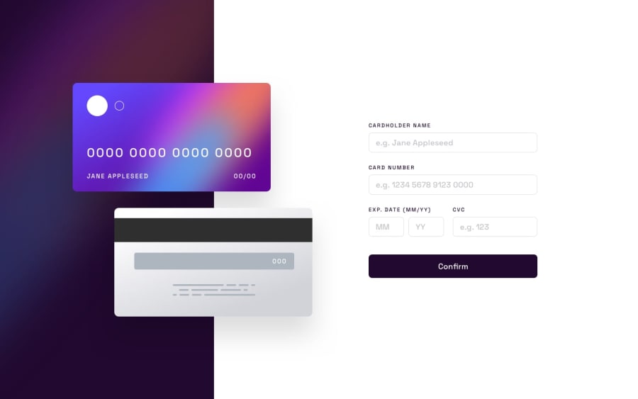
Design comparison
SolutionDesign
Community feedback
- @grace-snowPosted about 2 years ago
This is very slightly overlapping my phone screen atm. And the inputs are touching the sides.
Some important learning points about forms here
- Error messages should be wrapped in elements that are not display none, have a unique ID and an aria-live attribute on them. Then you can programmatically link the error and input with aria-desciribedby. You could probably add aria live to your existing error elements but only if the errors are empty by default
- The date inputs should be wrapped in a fieldset with the legend for the visible label. Then each input needs a visually hidden label just for themselves
- The thank you state also needs a non hidden element wrapping it with an aria live attribute on it
JS looks OK at a glance, but I think you could probably make it shorter and use less class toggles on individual elements. But that's all fine for now... One thing I'd recommend is using querySelector instead of getElementById. Just slightly more performant
Also, a good practice for js is to use
js-prefixed classes in the html to select what you want. Then it's really clear to devs glancing at html what the js is doing.Marked as helpful0
Please log in to post a comment
Log in with GitHubJoin our Discord community
Join thousands of Frontend Mentor community members taking the challenges, sharing resources, helping each other, and chatting about all things front-end!
Join our Discord
