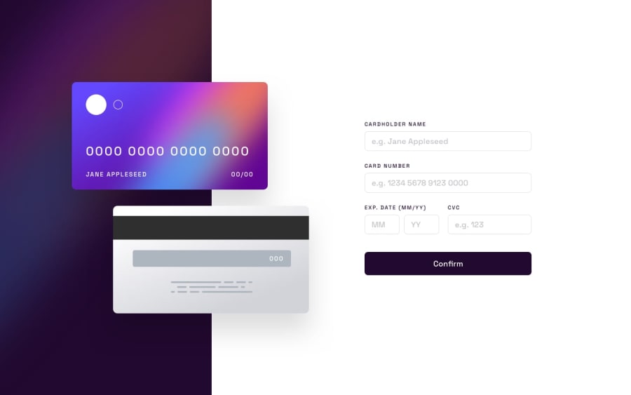
Interactive Card Details Form [ Mobile + Desktop + Plain CSS + JS ]
Design comparison
Solution retrospective
Heya there fellow devs!
Finally finished this project I started couple of days ago. This is the first project that I have done after I have started my JavaScript course couple of weeks back, and after finishing some sections I decided to test the knowledge I gained so far and I am pretty proud of it so far!
Let me know if you find any flaws, or something that you think that can be done better, and it would be a pleasure to take in feedback and learn more!
Community feedback
- @sulemaan7070Posted almost 2 years ago
hey Danilo😄, congratulations on completing the challenge... here are a few tips to make your site better.
1.When I try to click on the enter button without any input to any field.. the validation is good.. but the text on the cards like
0000 0000 0000 0000,jane appleseed,MMandYYeverything is disappearing which is not a good experience..2.You can use something like a terenary operator and conditiinally inject the text into the html
!cardHolderName? "jane appleseed": cardHolderNameOther than that everything is looking good..happy coding🔥🔥
Marked as helpful2@OneBitMancePosted almost 2 years agoHey there @sulemaan7070 ! Thank you so much for the feedback! I will implement the fix for that as soon as i can! ^-^
1
Please log in to post a comment
Log in with GitHubJoin our Discord community
Join thousands of Frontend Mentor community members taking the challenges, sharing resources, helping each other, and chatting about all things front-end!
Join our Discord
