Design comparison
SolutionDesign
Solution retrospective
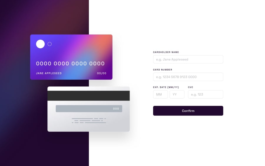
Hi, this is my version of the interactive card detail display. I struggled a bit with the design. So my question would be how could I make the design look better when transitioning into small form factor screens?
I feel like I wrote too much code in the style.css. How could I make my code more concise?
Community feedback
- @Aimal-125Posted over 1 year ago
It depends on how you wrote the html markup. And how you can then use css to get the required results.
0
Please log in to post a comment
Log in with GitHubJoin our Discord community
Join thousands of Frontend Mentor community members taking the challenges, sharing resources, helping each other, and chatting about all things front-end!
Join our Discord
