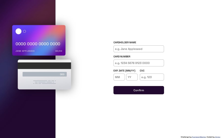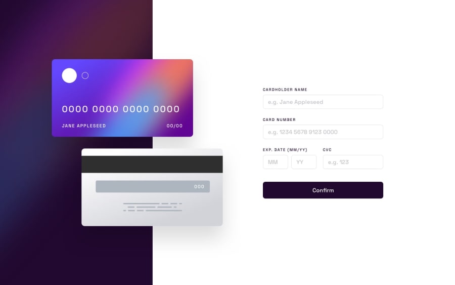
Interactive Card Details build with html css and js
Design comparison
Solution retrospective
I am not sure if i did it corectly, and I did a lot of mistakes, if you have some tricks or sugestions please tell me.
Community feedback
- @0xabdulkhaliqPosted over 1 year ago
Hello there 👋. Congratulations on successfully completing the challenge! 🎉
- I have other recommendations regarding your code that I believe will be of great interest to you.
BODY MEASUREMENTS 📐:
- Use
min-height: 100vhforbodyinstead ofheight: 100vh. Setting theheight: 100vhmay result in the component being cut off on smaller screens.
- For example; if we set
height: 100vhthen thebodywill have100vhheight no matter what. Even if the content spans more than100vhof viewport.
- But if we set
min-height: 100vhthen thebodywill start at100vh, if the content pushes thebodybeyond100vhit will continue growing. However if you have content that takes less than100vhit will still take100vhin space.
.
I hope you find this helpful 😄 Above all, the solution you submitted is great !
Happy coding!
Marked as helpful1 - @PpargPosted over 1 year ago
Hi, very nice work. I can see when i click on the submit button that the expiration month adds a 0 at the beginning when i try to submit the 09 input. Try to add a condition at this part of your code, maybe a condition given the length of inputMonth.value :
inputMonth.value = parseInt(inputMonth.value) > 12 ? "12" : parseInt(inputMonth.value) < 10 ?0${inputMonth.value}:${inputMonth.value};Marked as helpful1
Please log in to post a comment
Log in with GitHubJoin our Discord community
Join thousands of Frontend Mentor community members taking the challenges, sharing resources, helping each other, and chatting about all things front-end!
Join our Discord
