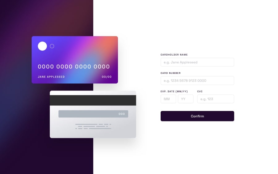
Design comparison
SolutionDesign
Solution retrospective
Again, I struggled with the responsiveness of the app. It's a lot that I need to work on when it comes to that. So far, I loved working on this project the most.
Community feedback
- @adex-hubPosted over 1 year ago
Hi Terriona, nice solution but in order to center the cards vertically consider adding the following code to the parent element of the two cards.
display: flex;
flex-direction: column;
align-items: center;
If that doesn't work you might need to center it vertically using
position: absoluteand CSS properties such astopandtransform: translate Y(50%)Marked as helpful0@tbecreativePosted over 1 year ago@adex-hub I'm going to go back and try that! Thank you so much for your feedback!
0
Please log in to post a comment
Log in with GitHubJoin our Discord community
Join thousands of Frontend Mentor community members taking the challenges, sharing resources, helping each other, and chatting about all things front-end!
Join our Discord
